Foxholes Honey Bees.
The Brief.
Project Branding
Creative Team Sophie Janes
Our Tools Adobe Illustrator
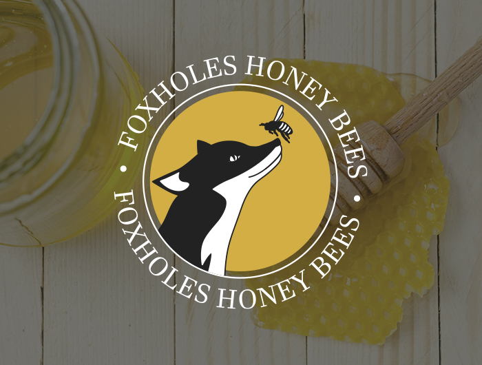
Foxholes Honey Bees approached us looking for a logo for their new company. The brand had to be clean and sophisticated to suit their target market and their products. It had to include a combination of a fox and a honey bee whilst looking high end and had to work in monochrome.
“Holler Marketing are a great friendly team. We did not know what to expect from a graphic designer however, any fears we had were allayed from our first chat with Sophie. Sophie was full of ideas, easy to work with, happy to explain things in simple terms we could understand and turned our designs around in record time. Sophie took our initial thoughts and came up with a number of possibilities for our logo design and branding, providing advice on what would work well for websites, social media, stationery and labels for jars. We are extremely happy with our logo and branding created by Sophie.”
Richard Smith, Foxholes Honey Bees
What we did.
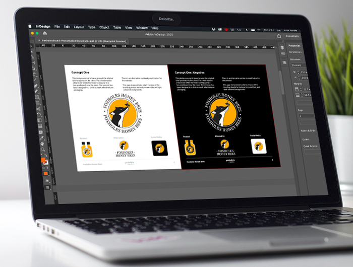
After an initial discussion, we worked closely with the client to develop a logo for their brand. We created several different concepts around their initial brief and worked closely to tweak and develop a brand that would suit their USPs. We chose a serif font combined with a colour palette of white, black and yellow/gold to fit the honey side of the business.